
Enhancing user experience in Just Eat Takeaway's order tracking system
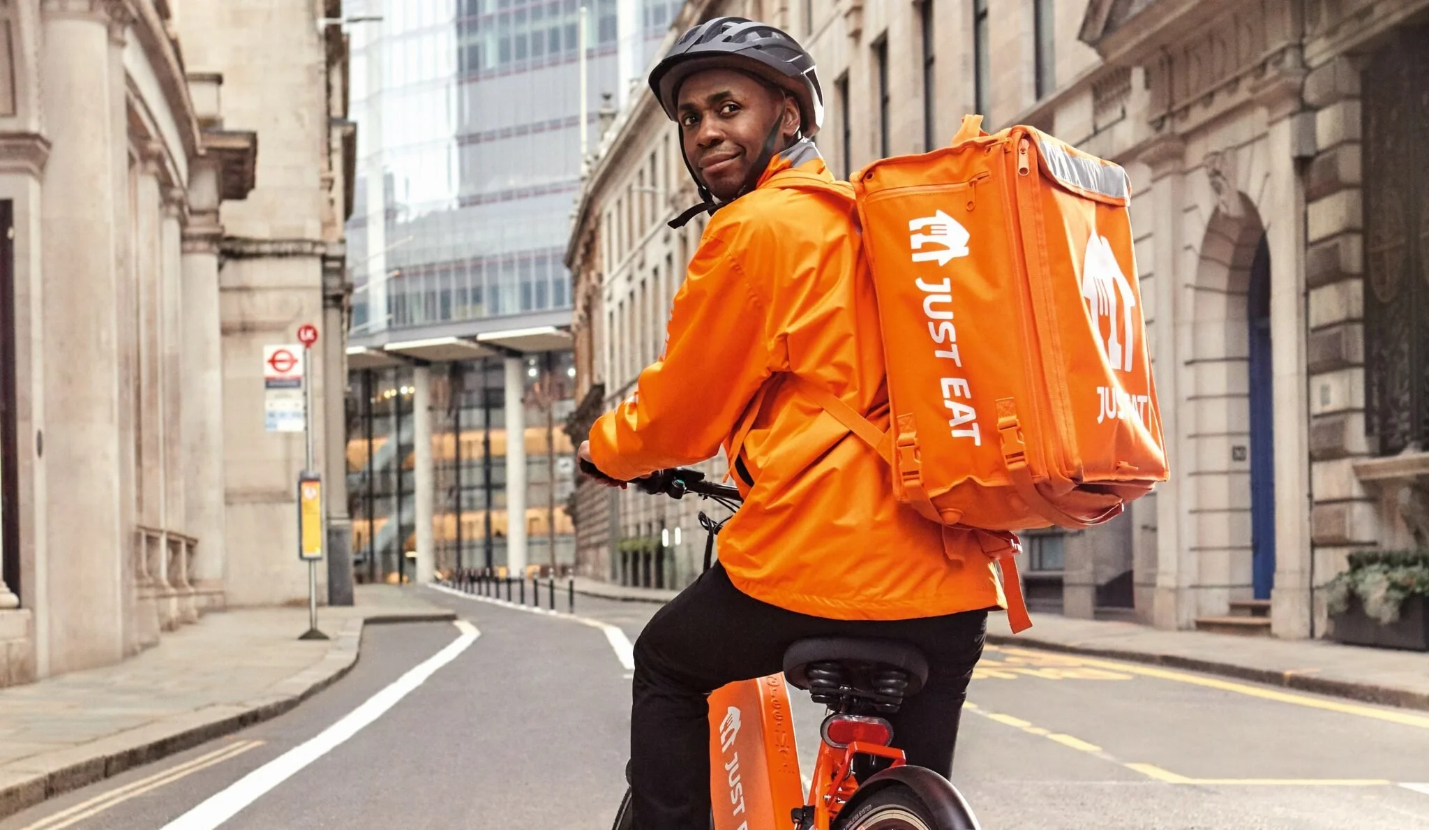
Every day, countless customers worldwide rely on Just Eat Takeaway.com for ordering food or groceries. They navigate through the app, selecting items, completing payment, and landing on the order tracking screen for live updates.
Behind this seemingly straightforward process lies a complex network of actions. Restaurants or stores accept and prepare orders, while JET’s system coordinates with couriers who have to navigate different conditions to fulfill their deliveries. Factors like restaurant workload, courier availability and regional traffic dynamics add layers of complexity. Moreover, customer expectations vary greatly; some closely monitor tracking updates, while others engage minimally.
The order tracking screen serves as a focal point for users seeking appropriate and useful updates. But determining the "right updates" and designing a UI that balances information provision without overwhelming users has its challenges. This case study offers insights into our design process, highlighting some of the key considerations and obstacles we encountered.
The project in a nutshell…
THE OBJECTIVE
In early 2023, as part of the Customer Design team at JET, we began a comprehensive effort to overhaul the user experience (UX) and user interface (UI) of the entire Just Eat app. This initiative was partly in anticipation of our upcoming global app and web platforms set for release in 2024.
THE APPROACH
We carried out research, user testing and heuristic evaluations to identify pain points and opportunities. Then we implemented improvements focusing on improving the communication of order statuses, information hierarchy of the UI, improving the order tracking experience and enhancing all accessibility features.
MY ROLE
As a member of the Customer Design team, I contributed to the redesign efforts by providing insights, helping conduct user research and collaborating closely with cross-functional teams of designers and developers to design & develop a fully functional experience.
“How do we provide customers with the right information at the right time?”
– One of the key questions we tried to solve for the UX/UI revamp
What were the main problems?
To understand where opportunities and challenges lay, it was important to start from observed problems with our platform (screenshot below).
The limitations of our old order tracking screen were limiting our ability to implement enhancements effectively. With Just Eat Takeaway.com expanding its delivery services to include groceries, electronics, and even toys, our previous tracking system became insufficiently scalable to accommodate this new dynamic.
Placing an order should be a carefree, positive, and above all, reliable experience. We wanted to be more empathetic and supportive throughout the order tracking experience
We identified the need to enhance the information customers received while awaiting their orders. We noticed that users often had an inaccurate understanding of what was happening, partly due to the order statuses we provided. These statuses varied depending on the order type, restaurant-provided updates, and other factors. We wanted to be more consistent, clearer, and reliable, regardless of the order type.
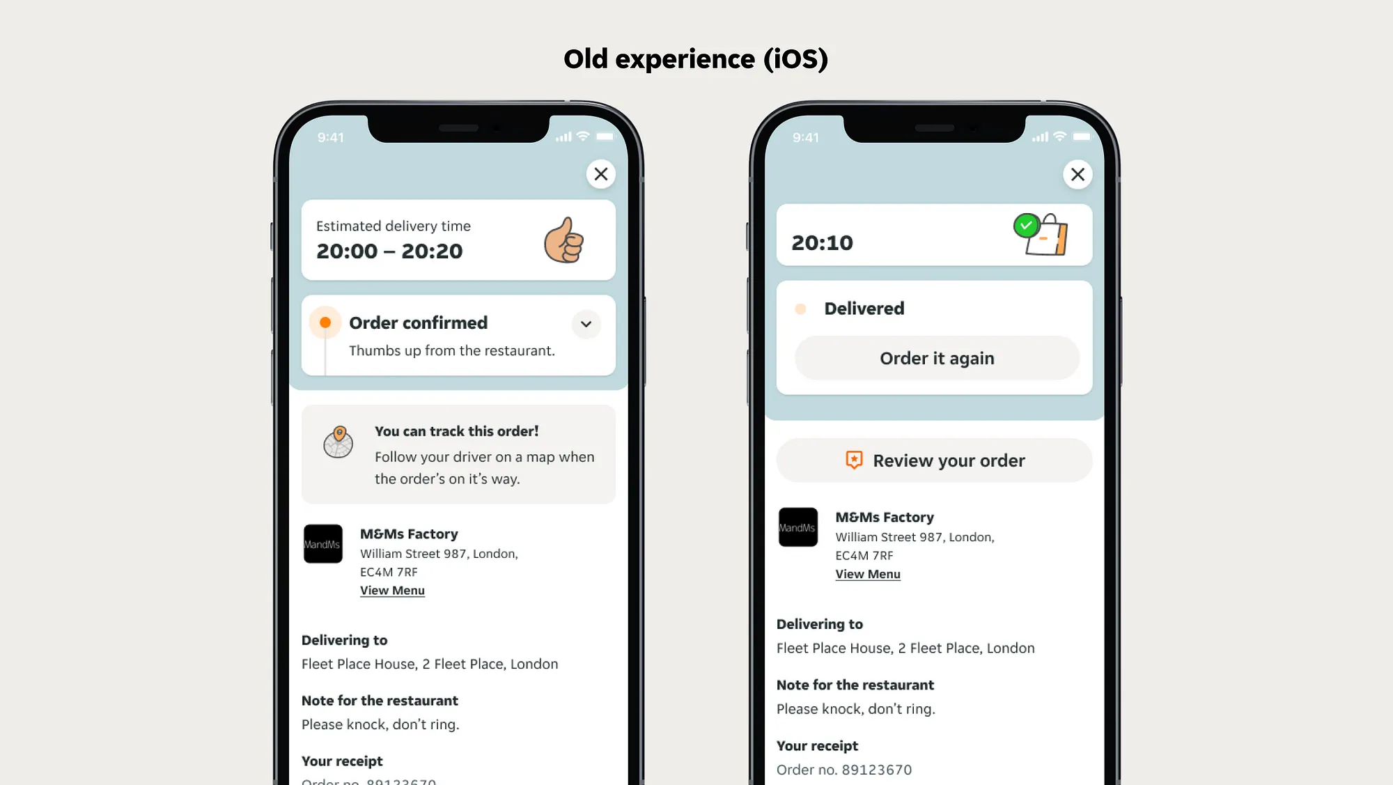
01. The old after-orders experience in iOS
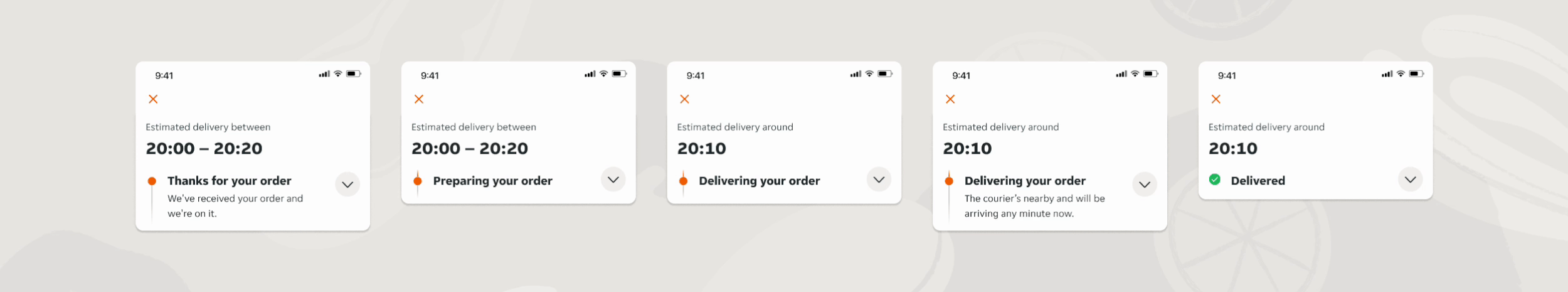
Improving our order status experience
The order tracking screen centers around Estimated Time of Arrival (ETA) and order updates, forming users' mental models based on expectations and past experiences. However, answers from users during research highlighted inconsistencies due to various types of order updates being provided. For orders delivered by partners with their own couriers, limited updates were available, leading to ambiguity. In contrast, orders delivered by Just Eat's couriers had detailed logistics-focused statuses, contributing to an inconsistent experience.
To address this, we redesigned order statuses to strike a balance between transparency and clarity. Through iterations, we established a core process for every order, simplifying it to key steps and providing detailed information in sub-statuses. For example, 'Awaiting confirmation' was replaced with proactive outreach for unconfirmed orders to maintain a positive experience. A/B testing validated these adjustments, ensuring effective deployment globally and reducing customer service queries.

The importance of information hierarchy
As a product designer, it's crucial to create screens that not only look appealing but also function effectively. Understanding customers' preferences and needs was a central focus during our numerous research sessions.
Following order placement, most customers typically check the estimated delivery time and order status before setting their phones aside. However, a significant portion of users actively monitor their orders, especially in case of unexpected issues. Therefore, it's important to ensure all necessary information is readily available.
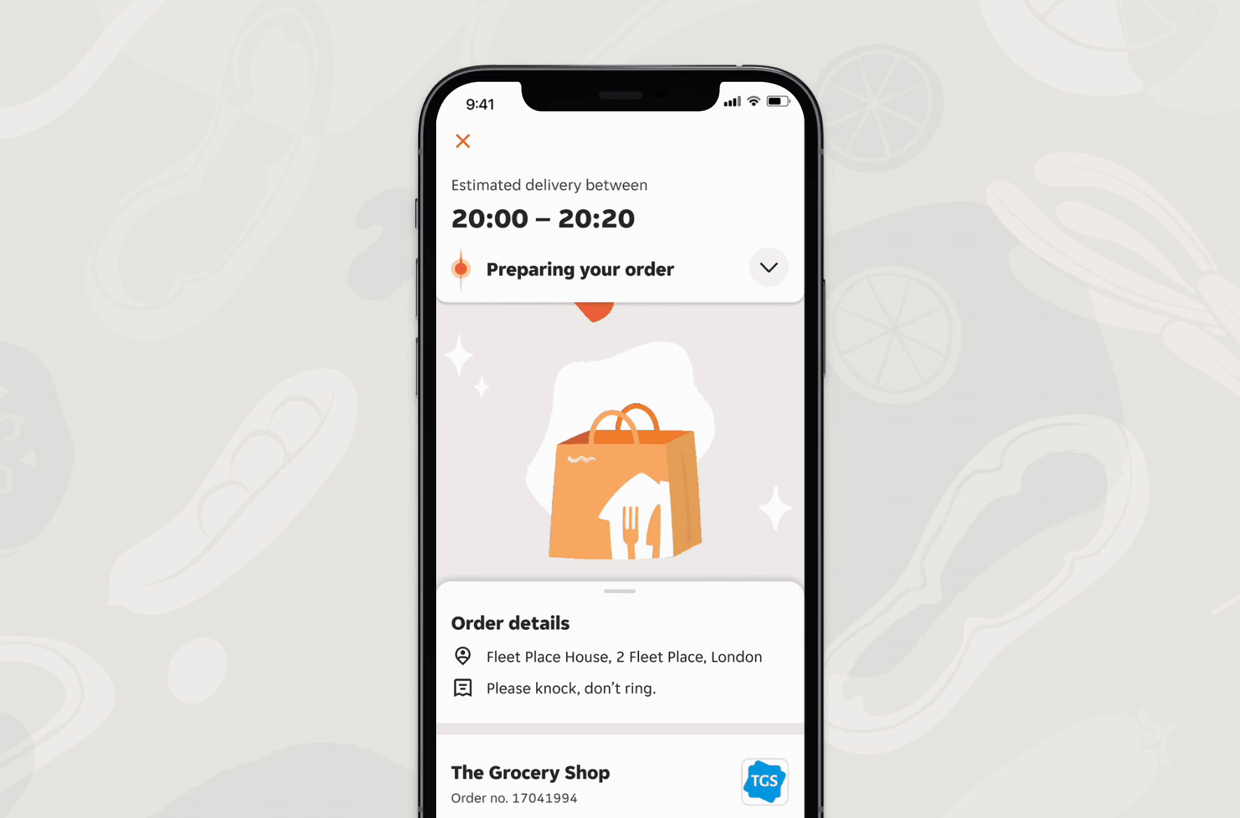
To address the challenge of limited screen space, the order tracking screen is divided into three sections: the top section displays arrival time and order statuses, the middle section features animated illustrations or maps, and the bottom section provides additional details.

Creating new UI components and thinking outside the box: The stacked notification
To discreetly alert users about important events during the order process, we introduced stacked notifications. These notifications subtly inform users about critical occurrences like out-of-stock items or delivery delays, ensuring they remain engaged without overwhelming the screen. By incorporating stacked notifications, we stroke a balance between keeping users informed and preserving a seamless ordering experience.
02. An animated prototype of a stacked notification for unavailable items.
Improved order details
Further down the screen, we made improvements to the order details. For example, we changed the receipt to only display essential information. We found that the majority of users required a brief overview of their order, but just a small percentage needed a comprehensive breakdown of the receipt. By showing a summary of the order, we reduce content overload, while allowing customers in need of a full receipt breakdown to access this with a simple tap.

03. Enhanced receipt layout, with a comprehensive breakdown available for those who need more detailed information.
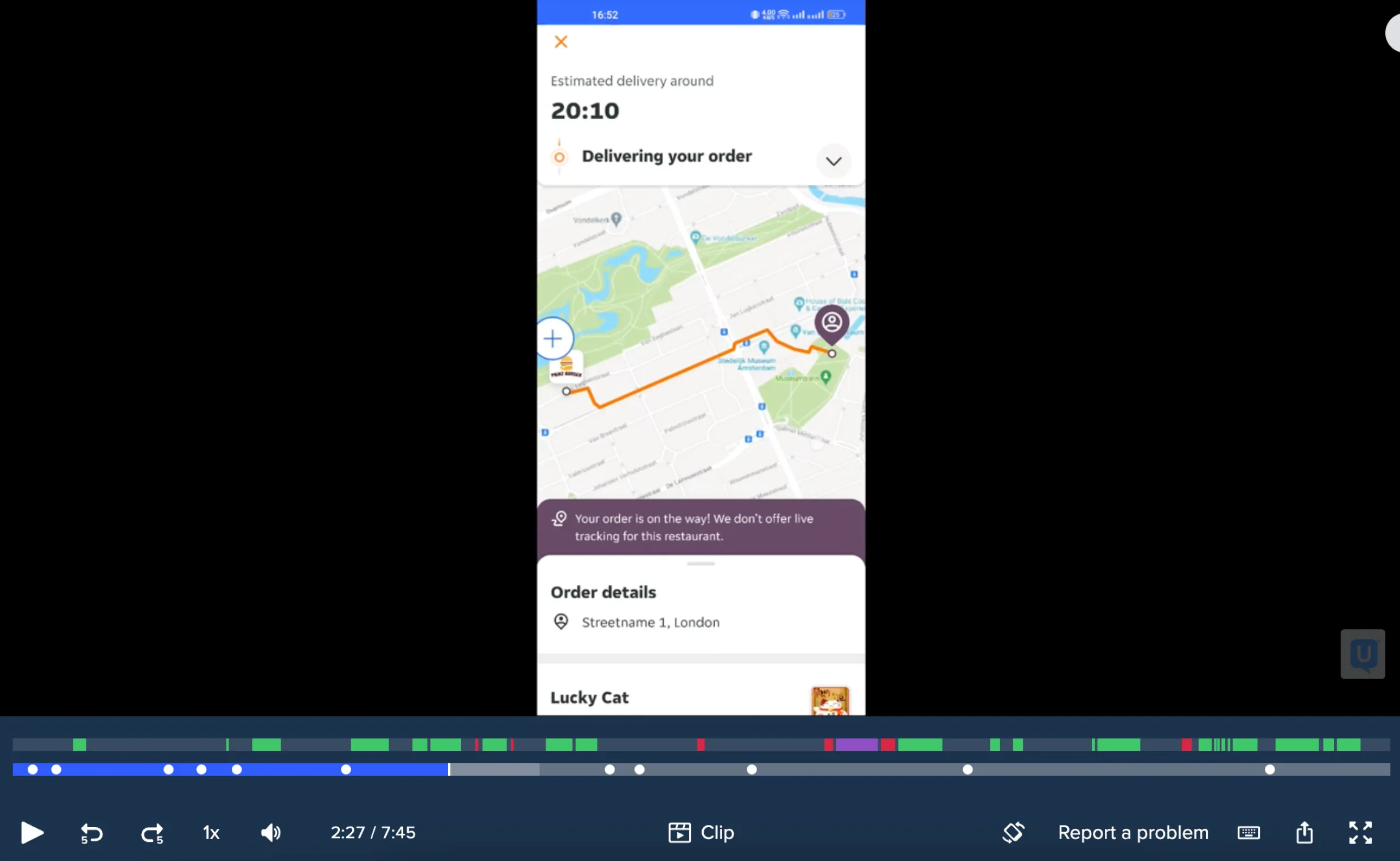
Enhanced tracking experience
Many customers like to track their delivery on the map. But sometimes, seeing the order getting closer can also make people feel nervous. For example, in busy cities, customers often wait by their windows until the courier arrives, then rush to the door.
To make tracking easier and less stressful, we simplified the map design. We also added route predictions so customers can better guess when their order will arrive. And we made it clearer when orders are grouped together.
The importance of accessible order tracking
We prioritised inclusivity and accessibility in our designs, ensuring that users from diverse backgrounds and contexts can easily navigate the after orders screen. We made sure the implementation supported features like enlarged fonts, high contrast levels and 'reduced motion' settings, benefiting users with visual impairments and sensitivity to motion. We also tailored our apps to accommodate both large and small screens, as well as dark mode.
For instance, user feedback revealed challenges faced by those using enlarged fonts, especially when accessing the order tracking screen where the live tracking map became difficult to use. To address such issues, we proactively considered user needs from the outset and conducted thorough testing throughout development

04. Left: device with increased font size settings. Right: dark mode.
05. A screenshot of a replay video showing an interaction with a tester.
The result
The revamped order tracking system in the Just Eat app reflects a commitment to providing users with a seamless, transparent, and enjoyable experience. By addressing key challenges and implementing user-centric design principles, we laid the groundwork for continued innovation and improvement in the customer journey.
KEY LEARNING
Considering accessibility focused scenarios from the start and testing throughout development allowed us to address issues proactively. This approach helped us to anticipate challenges and optimize the app for accessibility, ensuring a seamless experience for all users.
TOOLS & SOFTWARE USED
Figma
usertesting.com