
Creating a design system for New York Life’s and AARP email communications.
AARP and New York Life’s partnership brought life insurance to another level, becoming one of the most successful and trusted services in North America. But, inevitably, this new alliance would report many changes for both companies, especially in one of their most efficient channels of communication: Emails.
Email communications needed to be built from the ground up. One of the most significant constraints was that both AARP and NYL’s (New York Life) brand needed to be represented in the visuals, which meant that they couldn’t lift communications from their own departments and make them work directly. But not everything was bad news, a new opportunity rose for both teams. They could finally assess their own email communications, making sure that their new joint effort would set a new standard for both organisations.
So with all that, NYL asked us to help them create this new set of email communications. They also wanted us to think about strategy and how design elements could help increase the value of each customer touchpoint. Once this was done, a design system needed to be implemented so that their internal team could effectively create new communications easily and quickly.
The project in a nutshell…
THE OBJECTIVE
We had to come up with AARP and NYL’s new Life Insurance email communications, creating a customer touchpoint strategy and delivering a functional, easy-to-use design system that would set the new standard within both companies’ digital communications.
THE APPROACH
Understanding the process was only the first step, but certainly an important one. Once this seemed clear, we drew a communications strategy which would allow us to understand the initial scope of the design elements we would need for the emails. After that, we took our work to the drawing board, creating wireframes and prototypes, and once all of that was done, we created the design system for their internal team.
MY ROLE
I led the wireframing process and worked closely with the client’s internal teams. I was an advisor in the strategy process, often assessing other participants with technical possibilities of the project and the constraints. I built all the assets for the design system in Adobe XD, which would then be turned into an online design system by NYL’s team of developers.

“We need to think about the strategy, learning how users currently interact with our communications is the key that will unlock all doors.”
– Insight from the strategy stage
Communication strategy and user behaviour became the primary focus of the project. Thanks to that, AARP and NYL now have robust email communications.
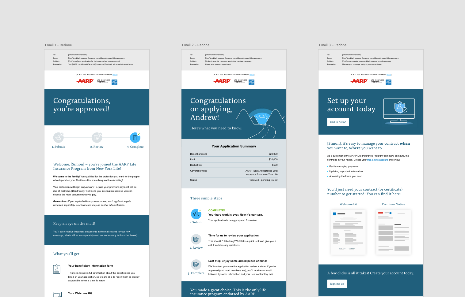
01. The image shows a bit of the onboarding flow.
“Not all design systems are equally effective. Some can generate coherent user experiences, others produce confusing patchwork designs. Some inspire teams to contribute to them, while others are neglected. Some get better with time, more cohesive and better functioning; others get worse, becoming bloated and cumbersome.”
— Vitaly Friedman
The text above belongs to a fragment of an article published by Vitaly Friedman on Smashing Magazine, where he talks about Alla Kholmatova’s (former interaction designer at FutureLearn) book ‘Design Systems’. This particular bit sparked my curiosity and would become the angular stone of our approach when creating the design system for the email communications.
As with every design system, we had to decide what level of detail and strictness it would have, how the system would be updated or how to effectively name every component. There is so much to talk about when describing the work that goes into developing a design system that a single image can’t capture it all. However, below you’ll find a screenshot of one of the last iterations, before NYL’s developers created a coded version.
Design system highlights
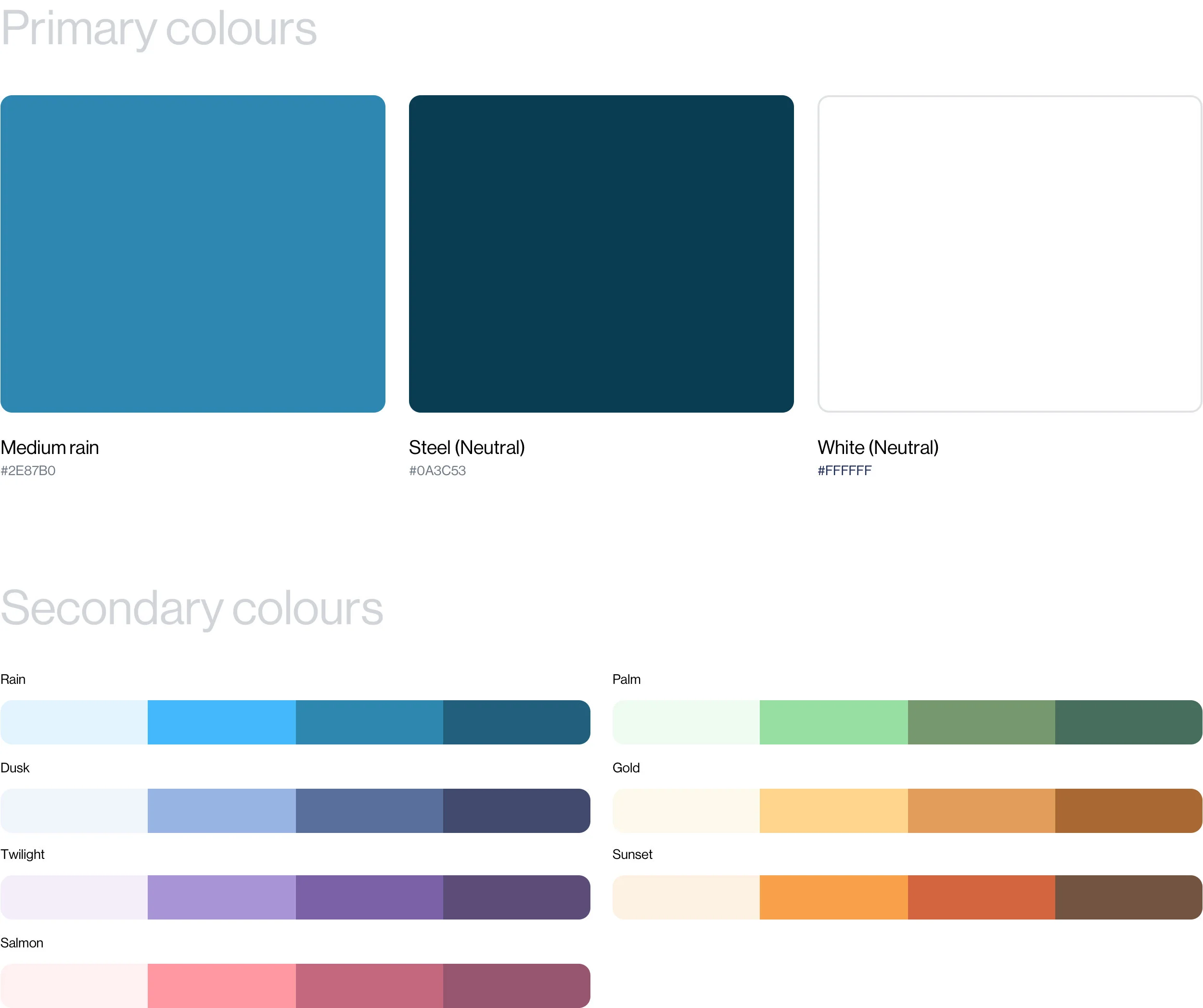
02. An example of the colours overview in the design system platform

03. Typographic hierarchy was one of the most important aspects of the system, but also one of the most complicated bits to tackle.

The result
Thanks to the new email communications strategy, AARP and NYL’s partnered Life Insurance doubled a year’s digital uptake in just two days. Up to this date, and thanks to the design created for them, their internal team can take care of new communications without depending on external agencies.
KEY LEARNING
Straightforward communications, which focus on very specific end results, have a higher impact on conversions. A simple customer touchpoint (like an email) can make all the difference when it has been designed to target those results.
TOOLS & SOFTWARE USED
Adobe XD
Invision
Docusaurus